 |
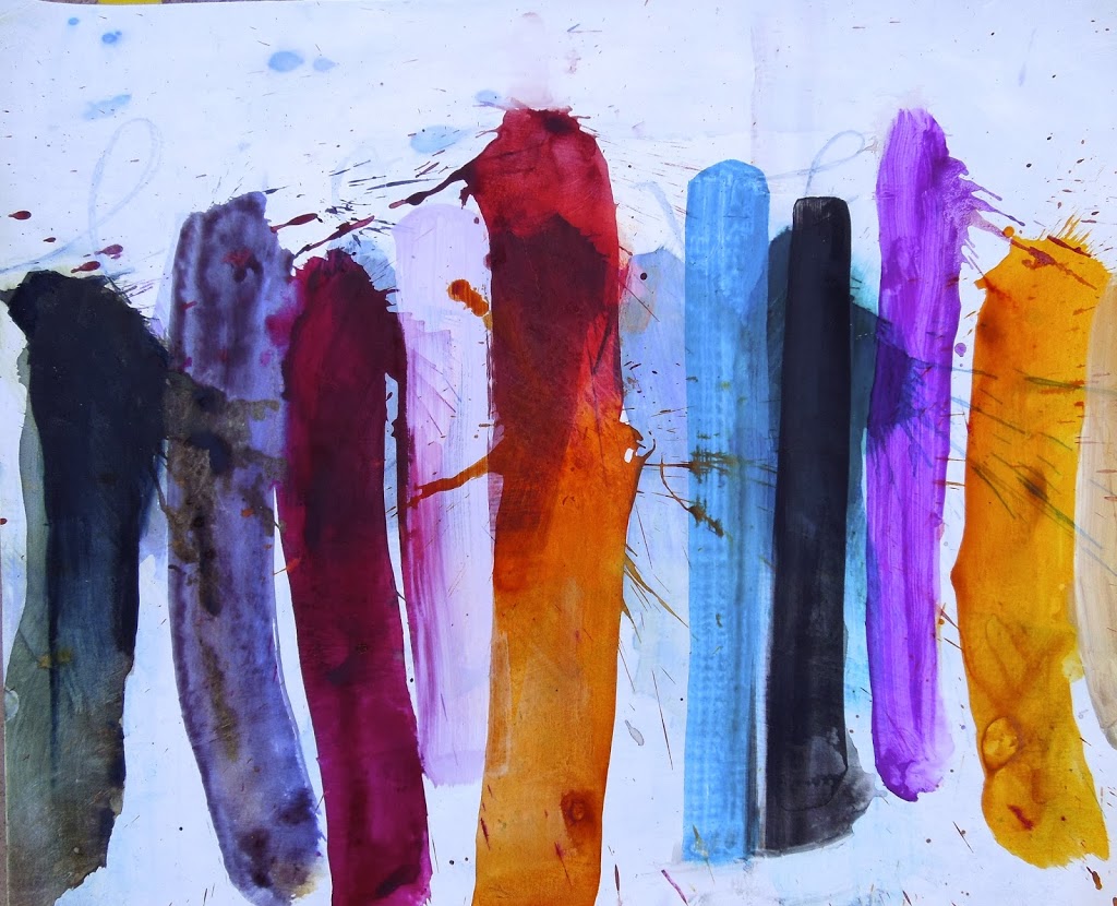
| A painting of mine from this year called The Ecstatic Beauty of It All (Carrie Bloomston) |
I wrote in the last post here about the “idea” of colors. I also wrote about how we are instructed early by painting teachers to never use paint right out of the tube. This is such an important point and I want to explain it further here as it applies to every area of art, design, sewing, crafting, etc.
There are hundreds or thousands of varieties of each and every color. But if I say “red” you will conjure images of what red means to you. You have your own unique ideas and projections about every color. You have your least and most favorite shades.
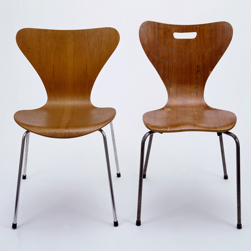 |
| source |
When I teach art or drawing to children or adults, I start with having them remove the images they have in their mind. Last year, I taught my son’s first grade class about Scandinavian Design. I brought in my Arne Jacobson chair and spoke about the fluid lines and common materials used in Scandinavia’s socialist design principle of design for everybody. (Think Ikea.)
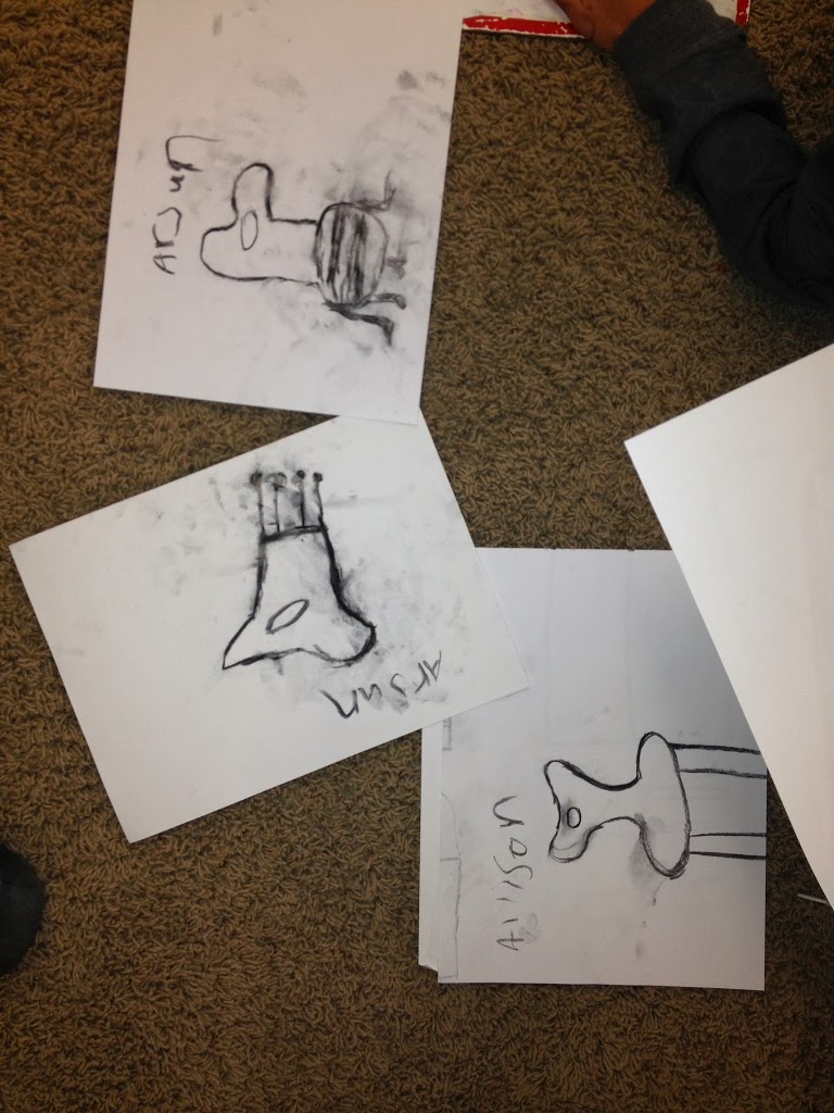
First, I had the kids draw the chair that lives in their mind. We all have archetypes up in our brain. When I say “chair” you conjure up an image of a chair. When you try to render the chair you are looking at, right in front of you, your mind will get confused and keep telling your hands what it thinks a chair looks like. Our mind informs our hands as we draw. The first graders drew the chair that lives in their brain. “Excellent,” I told them, “now that is out of the way. Phew!” These chairs looked rectilinear, blocky, slatted. Then I had them look at the curving, sensual forms of the Jacobson chair. I had them see the perspective of the seat jutting out impossibly towards them and creating that hard-to-draw compression we find in perspective and foreshortening. Their drawings were amazing! They totally got it.
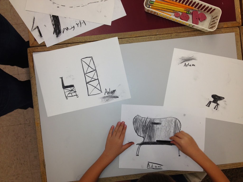 |
| The top left drawing shows Adam’s idea of a chair. He is drawing the Jacobson chair. |
You know who taught me this? Betty Edwards. If you haven’t read Drawing on the Right Side of the Brain, you might check it out. My mom and I attended one of her workshops in Alabama when I was a young teenager. Her book is seminal. She teaches people that drawing is all about truly SEEING the world as it is. She helps people circumvent the signals, messages, and projections coming from the brain, so they can draw what is there in front of their eyes.
The same is true of color. If I say “red” you may think fire engine, candy apple, terracotta, pomegranate, rose petal, blood, burgundy, Ferrari, brick, clay, ketchup, or tomato bisque. Some of those may be your projections and ideas about what red means, and some may be your unique color story. When we squeeze paint from a tube, we get the idea of a color. Cadmium red is “red.” Alizarin crimson is “cranberry.” And so on. These colors are too simple. They don’t surprise us because we know exactly what they are. That is why we don’t use color straight from the tube. It is just a building block, an idea. It is a starting point, from which you will create your expression.
When you are designing a quilt or making a painting, you will start by creating a palette of colors that work together to carry the spirit of your design. Only you know what lies in your heart. There is no right way or wrong way. No matter how many times I read about color theory and color relationships, I only see what I see. In textile design there is a lot of talk about triadic, split complementary, or analogous color relationships.
Blah, blah, blah, blah, blah, blah is what my brain hears when I read that stuff. I am not saying it isn’t important, but regardless of whether or not you have ever heard of analogous color scheme relationships, you are going to design and create what lives in your heart. And you should. Your heart is your ultimate guide when designing, at least it is for me. I listen to my intuition, I go by feeling, not the stuff I have read in books.
When I think about color, I close my eyes and dive in. I dig around to find the color that communicates what I am trying to say. I play with a few options until I like what I see.
I have recently designed my next fabric line and I was sure that I wanted “mint” in it. But when I saw it on paper it was yucky and awful–screeching and claustrophobic at once. It was the wrong mint. It was my idea of mint. It didn’t come from my heart, it came from my head.
So, mix it up! Dive in. Listen to your heart and see what happens with your next color scheme.
Thanks for this! Interesting read for those of us who are color and artistically challenged. 🙂
Yes, one must create from heart. ��
Hi, I went to quilt festival this weekend, my friend and I met you there a couple years ago. I saw your Collage fabric in person for the first time as well as your nest quilt, and I just wanted to tell yu they are beautiful! I can’t wait to make something with the fabric!
Thank you for posting this! I can completely relate to hearing “blah, blah, blah” when I read about analogous colors and the like. A person just knows what looks right to them. Sometimes it takes trial and error, but it’s so fun to come up with unexpected color combinations… and, usually, that means NOT following the rules!
This is a really important post and I’m grateful for it! You reminded me of some fundamental ‘stuff’ that I put away with my art degree. Hmmmm ….
really appreciate your thoughts here…